Context is important when we look back at the history of branding and design.
In the 1960’s and early 70’s, American Corporate identity was heavily influenced by the Swiss International Style, the wordmark having largely replaced pictorial representation of companies and brands. Recall, Vignelli introduced American Airlines to Helvetica in 1967, and Rand streamlined IBM in 1956. But, as we’ve come to better understand, trends provide the perfect opportunity to Zag, which is exactly what WolffOlins did across the pond.
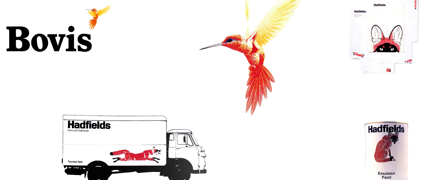
As the logotype became pervasive, WolffOlins, founded in 1965, convinced paint manufacturer Hadfields to trademark an illustration of a fox. However, they did maintain the obligatory Akidenz Grotesk logotype to accompany the curious fellow. It wasn’t until 1972 that they eschewed sans-serif altogether for the construction company Bovis. In addition, Wolff pitched an intricate illustration of a hummingbird. The client had been expecting “a bull or some other metaphor for male physical strength.” As one could imagine, strength is what every other company in the trade represented. The hummingbird, instead, could act as a metaphor that symbolized and represented a company focused on delicate precision. It was the perfect Zag.
Wolff admits, though, that the idea was nearly lost due to his inability or, perhaps, unwillingness to sell the concept. After listening to the presentation, Bovis chairman, Sir Keith Joseph, asked for an explanation of the hummingbird. Wolff responded that he “just really liked it.”