April 14, 2021

My Next Best Agency

I learned practically everything I know about design at my favorite agency in Connecticut, Taylor Design. It was the job I didn’t get coming out of Syracuse University — which made it all the more attractive — and especially rewarding when they hired me two years later.

I spent the next 7 years as a design sponge, soaking up every drop of inspiration from an extremely talented group of creatives. Even then, I was interested in every aspect of creative problem-solving, including the business. When I bluntly asked Dan, the owner, how to run a design studio, he responded with the best advice imaginable. “Keep your eyes open,” he said.

And so I did.

After that, I took an opportunity as an art director at an advertising agency in Westport, Catapult Marketing. This is where I learned about advertising and promotion. The CEO was extremely smart and passionate, and surrounded us with the most brilliant minds in the business. The CCO, Dave Fiore, was a visionary who knew how to challenge the status quo, and squeeze every ounce of creativity from every office. Together, they built a culture of innovative thinking that was both challenging and exhilarating. As is often the case with success, the agency became a hot commodity and, needless to say, it’s not the same company anymore. For a while, though, I’m convinced it was the best advertising agency in Connecticut. How fortunate am I, to have worked at two great companies, and to have learned from two great mentors? What could possibly be next?

To be sure, I was never interested in moving to my next favorite agency. Or the next best.

Looking beyond 2020, it seemed as if remote working would certainly expand the number of opportunities for creatives. A number of great agencies remain in the area as well. But I’ve always been particular and deliberate about the brand of creative problem-solving I get to call my career. And, as practical as I can be, intuition has always informed by best decisions. After two great companies, plenty of planning and internal debate, instinct led me to believe that 2021 would present the greatest opportunity yet.

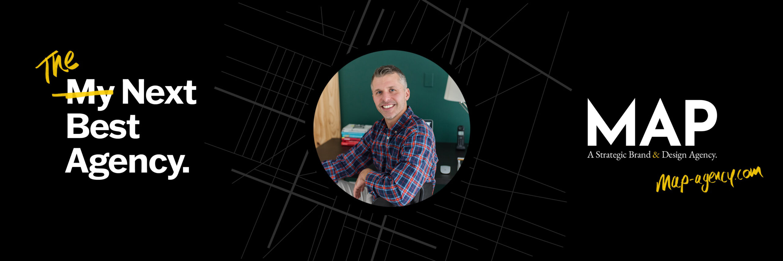
That’s why I started my own Agency, Map.

As we begin to roll out, I look forward to sharing more about us, our brand of creative and, for those interested, the trials of starting a business in the middle of a pandemic. Our mission is grand: utilize design to make the world a better place. However, the way we intend to do that is modest: retain and build upon the qualities that made my favorite agencies such fantastic places to work. That's the simple plan to hopefully make my next agency, the best.

March 4, 2021

King Gets His Due

Brody, Saville, even Bubbles ­— All British designers whose work pushed established norms and helped define graphic movements in the late 70’s and early 80’s. At least within the pages of history, they each became synonymous with a certain look or style — Bubbles is to Punk what Brody is to New Wave Typography. Perhaps their status is a result of the genres in which they helped define.

There is another Brit, though, that possessed a certain fashion, but designed the power of message in a way that eclipsed trend — Dave King. The name may be unfamiliar, but as art direct of the London Sunday Times Magazine, his Constructivist-inspired solutions were certainly recognizable. And, thanks to Rick Poynor’s monograph, “David King: Designer, Activist, Visual Historian,” (2020) this graphic design genius may finally be getting the recognition he deserves.

Let there be no doubt, King was a well-respected and award-winning designer during his practice. As he shifted his focus to collecting artifacts from the Russian Revolution and authoring books, he became less relevant in the rampant discussion about design authorship during the age of computer-generated design. In hindsight, this is unfortunate. His work as an activist should have been at the center of any such deliberation.

While his approach to design was certainly influence by the Russian Constructivists, and therefore could be interpreted as “post-modern,” they were also done with purpose. For example, “Demonstrate!” a poster King designs for the Anti-Apartheid Movement in 1978, clearly made reference to Rodchenko (and, to a lesser extent, Lissitsky) in order to deliver a powerful, politically-driven rally cry, in a similar way that design was harnessed for the Russian Revolution. King was not interested in design for the sake of design.

Primarily, history relegates the importance of this time period to advances in the medium, rather than the message, focusing on style and graphic surface, rather than substance and content. While it is somewhat expected, given the extreme graphic break that the computer allowed, it unfortunately left the important work of King to be an afterthought in dialogue and most publications.

That is, hopefully, until now.  In an interview with Steven Heller, Poynor proudly says of King, “He is one of Britain’s finest designers.”  

February 20, 2021

Art Direct America

In America, the occupational title of the art director preceded that of the graphic designer.

While the lines between roles have been blurred today, the importance of advertising in editorial created a more specific need for the Art Director in early 20th Century. It wasn’t until the Art Director’s Club of New York, formed in 1920, started publishing its famous Annual that recognition was given for achievements in graphic design created outside of advertising – primarily letterhead and display materials.

Among the earliest art directors was M.F. Agha, a Russian who came to America while working at the German edition of Vogue. While his name is rarely mentioned in design history classes, he’s featured prominently in Hollis’ Graphic Design: A Concise History (the source and inspiration for this post), and his work was ubiquitous in America, gracing the pages of Vogue, Vanity Fair, and House and Garden. 

February 18, 2021

Vision in Motion

Kenneth Hine, a professor at Syracuse University, kept a bibliography of the most important books on design, cleverly titled, “Hine Sight.” He sold perfect-bound versions of it at the copy center, and I believe even offered course credit to anybody that read every book listed. Of course, the task was impossible – the book is 137 pages, and lists over 300 resources.

I’ve kept it, of course, just like every book I’ve ever purchased. Over the past 20 years, it’s been packed in a box 5 times, and hauled to each new apartment, living for the past 6 years in the basement of our house. Occasionally, I still dust it off, bound and determined to at least make a dent in it.

Most of the books still remain elusive to me. For example, Vision in Motion, by Lazlo Moholy-Nagy, which is listed on the very first page. Hine describes it as “The most important book ever written about design philosophy, education, and practice.” So you can imagine my guilt for not having read it.

There was a time, though, in 2010, that I actually held the book in my hands. I was in a rare bookstore in San Francisco, perusing the design section. I happened upon the hardcover and, though it was in a plastic sleeve, it was immediately recognizable to me. I looked at my wife – girlfriend at the time – and said, “I’ve been looking for this book a long time.” 

“You should get it,” she said.

I can’t recall the price listed on the back, but I know it was well out of reach. I slowly placed the book back on the shelf, and shortly after we caught a plane back to New York. 

Today, you can find used copies of “Vision in Motion” on Amazon for $45, though there are 4 copies listed at over $400. I’ve never really thought about purchasing one, because it doesn’t seem like a book that should arrive in the mail. Or maybe it should. Either way, I do think about the version I held in my hands once. In hind site, perhaps I should have purchased it.

February 17, 2021

Master of Imperfection

In the early 2000’s, Art Chantry was experiencing somewhat of a revival in popularity, partially due to the release of his recent monograph. In retrospect, the overwhelming response in awards can be seen as expected, after almost a decade of computer-generated design. His low-tech approach for album covers associated with the grunge scene was fresh again.

Nearly a Century earlier, H.N. Werkman also decidedly eschewed advances in technology and printing. While other Dutch designers were taking advantage of the precision of metal type and sophisticated new photographic techniques, Werkman took the opposite approach. Often working without a press, his hands-on approach resulted in ink blots, smudging, rough edges, and overlapping shapes – a slap in the face to commercial design, and nothing short of glorious. 

Sadly, Werkman was executed by the Nazi police for running a clandestine publishing house during WWII. Is it time for a Werkman revival in 2021?

January 5, 2020

The Devaluation of Stock

On Monday, March 2nd, 2009, the Dow Jones Industrial average fell under 7,000 for the first time since 1997. NPR had assured me of this as I was packing up for the day. Since I rarely concern myself with the stock market, the numerically sound fact struck me as something that surely related to design, but I couldn’t remember what that was. I wrapped a scarf around my neck and headed out, one foot in front of the other trying to reconnect-the-dots in the frigid winter air. As soon as I entered my apartment, I began fervently shuffling through papers in the recycling bin. Whatever complacent connection I was trying to make was in there somewhere.

Read more

Your subscription could not be saved. Please try again.
Thanks for subscribing!

Subscribe to our newsletter to see recent projects, and stay up-to-date with the brand lanscape.

The Studio

Have an interesting idea or project in mind? Let us pour the coffee.

Map Agency
27 Glen Road, Suite #200 
Sandy Hook, CT 06482

Let's Connect

Send a letter, give us a ring, or follow us on social.

Phone: +203.304.1846
Email: hello@map-agency.com

View