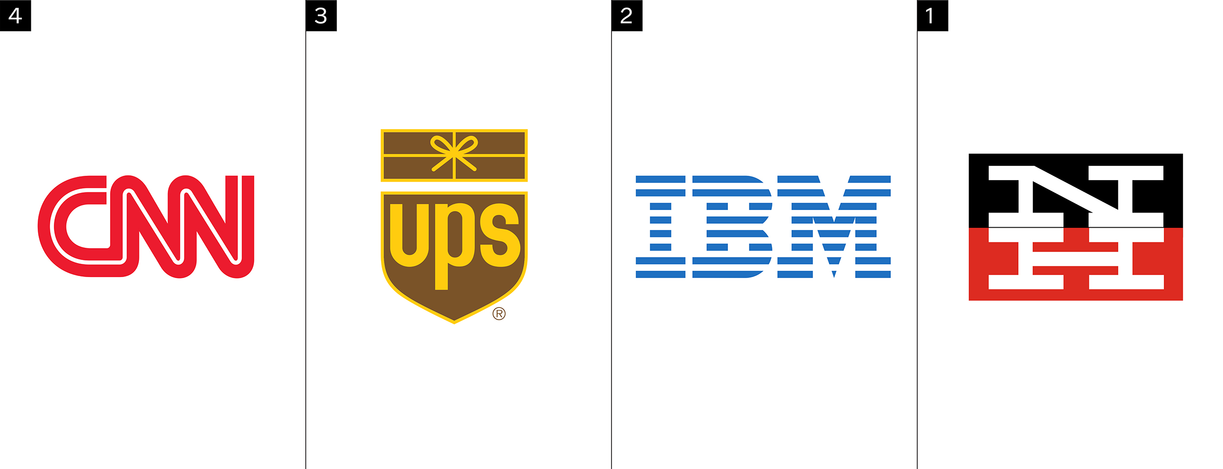
It's almost impossible for a graphic designer to pick his or her favorite logo. How does one even decide between a word mark, a pictorial logo, or an emblem? There are too many variables. To make it easier, John narrowed his logo options to just monograms. Below, he describes the reason for each of his top 4 monogram logo selections below.
Number 4
While most of favorite monogram logos were created by well-known designers in the 1950's and 1960's, the CNN logo was designed in 1980 by the late Anthony Guy Bost. Relatively unknown in the design world, Bost was a professor at the University of Auburn, hired by an Atlanta-based ad agency called Communication Trends. CNN founder Ted Turner liked the idea of a monogram with a line through the letters, which reminded him of a cable connecting the characters. I've always liked how easy it is to read, while being somewhat abstract at the same time. It kind of reminds me of the NASA "worm logo," which also has quite a nostalgic brand following. Unlike the NASA logo, though, the CNN logo has withstood the test of time.
Number 3
It's no coincidence that one of my favorite monogram logos was created by one of my favorite designers — Paul Rand. Rand was one of the first Americans to promote the use of Swiss modernism in graphic design, which is why so many of his logos have stayed relevant for so long. They have a universal appeal to them, in my opinion. Unfortunately, UPS saw their expansion from package delivery as a reason to update their brand, and this logo was butchered in 2014. It's a real shame, since most people still associate UPS with delivery, and the original logo had so much more character to it.
Number 2
Look who makes the Top 4 list twice! Did I mention that Paul Rand is one of the most influential logo designers of all time? Rand believed that a logo needed to be designed with the "utmost simplicity and restraint" to stand the test of time. It doesn't get simpler than the IBM logo – Three uppercase letters, made up of 8 horizontal bars. The IBM logo looks as fresh today as it did in 1956.
Number 1
Herbert Matter was a Swiss-born American photographer and graphic designer that taught at Yale University from 1952 to 1976. Paul Rand (see 2 and 3 above) said, "the absence of pomposity was characteristic of this guy." And that's also how I like to look at Matter's work. Bold, modern, and straightforward are all words that come to mind when I look at my favorite monogram logo design of all time. The extended geometry of the serifs represent the cross-section of a railroad, creating a perfect visual metaphor. Apparently, Matter drew over 100 sketches before he arrived at the final solution, and I believe it — perfection takes time.