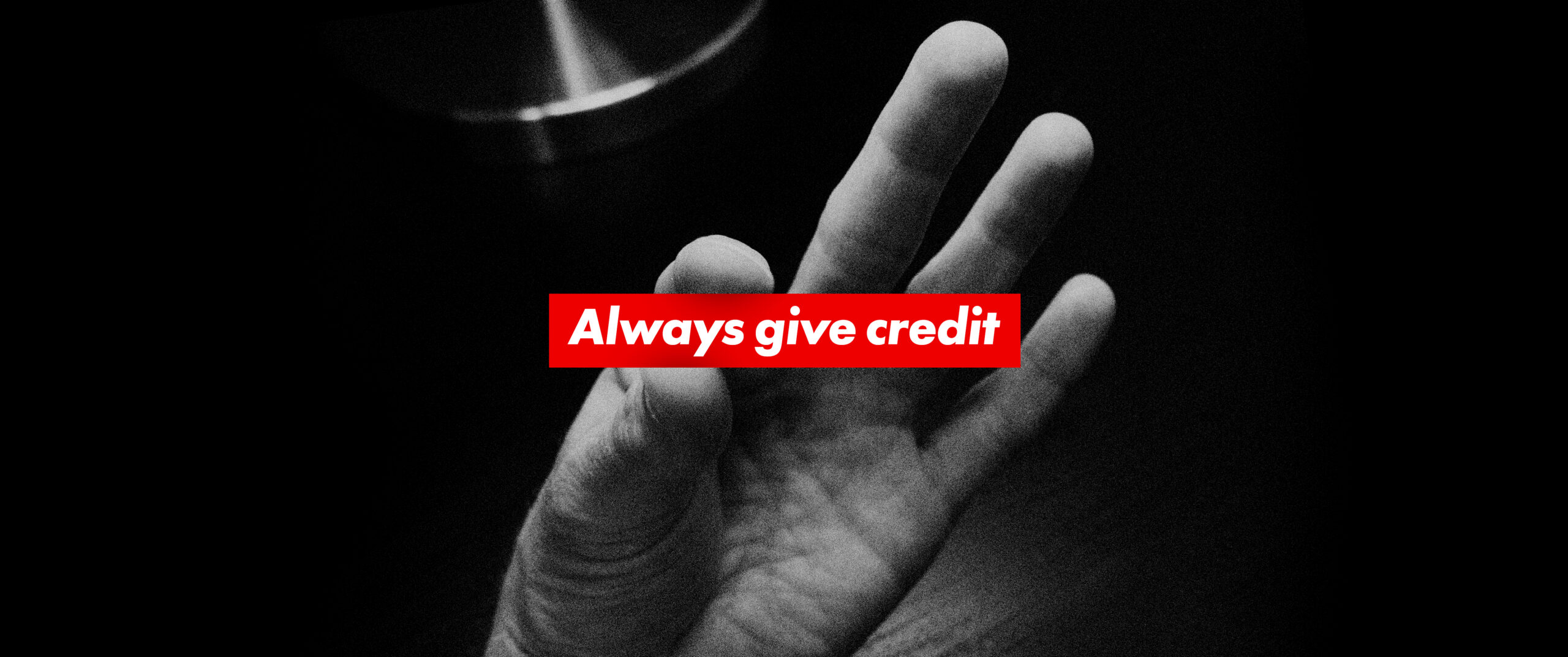
A fun exercise to try when you’ve run out of design solutions: set Futura Heavy Oblique knockout on bright red – maybe Pantone Red 032. Then take said layout and share it with a colleague, casually asking, “Does this design resemble anything you recognize?”
Design students are fairly educated today, but there was a time when some of us spent our nights in studio, cutting letters, and an occasional finger, with X-Acto blades. The result being, Art History 101 didn’t serve as well as a source for design inspiration as it served a practical time for sleep. In response to Futura Heavy Oblique resembling anything, very few could answer with the correct response, which is, “oh yeah, that looks just like a piece by the Barbara Kruger. Your layout is a complete knockoff of the artist who referenced advertising and leveraged design to make bold, graphic statements about feminism, struggle, and power in the 80’s. Didn’t you go to art school?” That’s the response you should be looking for, of course.
Instead, you might get a response like, “it kind of looks like that ‘Obey’ guy, what’s his name?” To which, its actually appropriate to lose your mind. Calmly explain, oh, you mean Shepard Fairey? I love his reference to 1920’s Russian Constructivist movement, though I tend to view his work more from a purely illustrative standpoint than with any deeper design motivation. The Russians really had a great handle on typography, didn’t they? By the way, did you notice that knockout type on the bold red background? Maybe don’t be quite so snooty.
Perhaps bring the conversation full circle with brief explanation of post-modernism and use of Appropriation in art. It’s okay to copy, even steal, from artists. But know who you are stealing from, so that you can reference them in conversation. At the very least, always acknowledge Barbara Kruger if you are going to set Future Heavy Oblique knockout on a bar of red. Having launched a sophisticated discussion and debate about design and history, consider the exercise a success.